 Coming Thursday, October 24, a new theme enhancement will transform your website to work seamlessly on smaller mobile devices.
Almost 20% of traffic to UF Health websites comes from mobile devices, and this amount is rapidly increasing. As more of our audience moves to using the web on their handheld devices, it became a priority for us to re-conceptualize the Apollo theme to be responsive – that is, the site changes its flow and structure to accommodate the size of the screen being used to view the site.
Images
By default, all images within pages and posts will now resize to fill smartphone’s screen width. Sometimes, however, this might cause some oddly shaped images. You will have some choices in customizing this:
- The mobile image resize may be disabled on the entire site via the theme options panel:

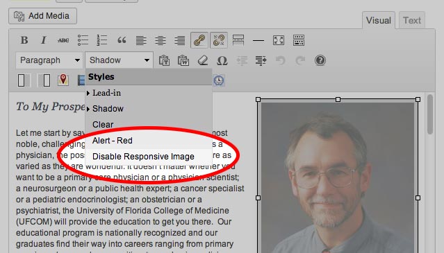
- or on an image-by-image basis in the WYSIWYG editor — simply select the image you DON’T want resized, and select the ‘Disable Responsive Image’ style. The image will then be left alone.

Featured Content Sliders
A new mobile-only slider appears on tablets and smart phones, consolidating both the ‘Story Stacker’ and traditional slider into one.

Note: in some rare cases, you might be using what we call a ‘full width image’ with captions disabled for your slider. These are normally images with text embedded in the image (for example, a banner or graphic made in something like Photoshop). If your slider uses these styles of images, you will want to use the new ‘Mobile Slider Image’ box, which is located below the Featured Image box.
- Upload your feature image and fill out the content fields in the Featured Image box
- Upload your modified image for smartphones in the Mobile Slider Image box
- Apollo will load the appropriate image for the users’ screen size.
Navigation
 On mobile devices the navigation moves to a fly-out menu that is accessible via the top-left menu button
- The sidebar navigation that appeared on many internal pages will now be accessible via the fly-out menu.
- Header links and social media icons that appear above the search on a full width site also move to the fly-out menu to the left.
- If you have activated user-role based navigation in your Apollo theme, this will convert to an accordion style navigation in order to conserve screen space and make a more efficient mobile experience.
Video
If you need to embed video, we strongly recommend using YouTube — it’s the best global solution. Contact Web Services to get more information about YouTube access.
Header Call to Action (Orange Button)
In the mobile display, you have two choices as to where the orange Header Call to Action button that appears:
- Below the title of the every page on the site
- As the first item in the fly-out navigation menu
Note: You can change it’s position by visiting the ‘Header Call to Action’ portion of your theme options.

Tables
Tables now scroll horizontally on mobile devices if they are too wide to fit otherwise. Just swipe the tables with your finger to see the rest of the data.
Website Title Sizes (Header)
Some website titles might be too long, or appear to large (or small). You will now be able to change the size of your website’s title for just mobile devices via the theme options:

We Welcome Your Feedback
Have any questions about the responsive theme or need help in adjusting or modifying some of the content for view on a smartphone? Web Services is here for you. Please contact us and we’ll be happy to assist.
